Outsourced Logo to Two AIs. But, Only One of Them Could Design

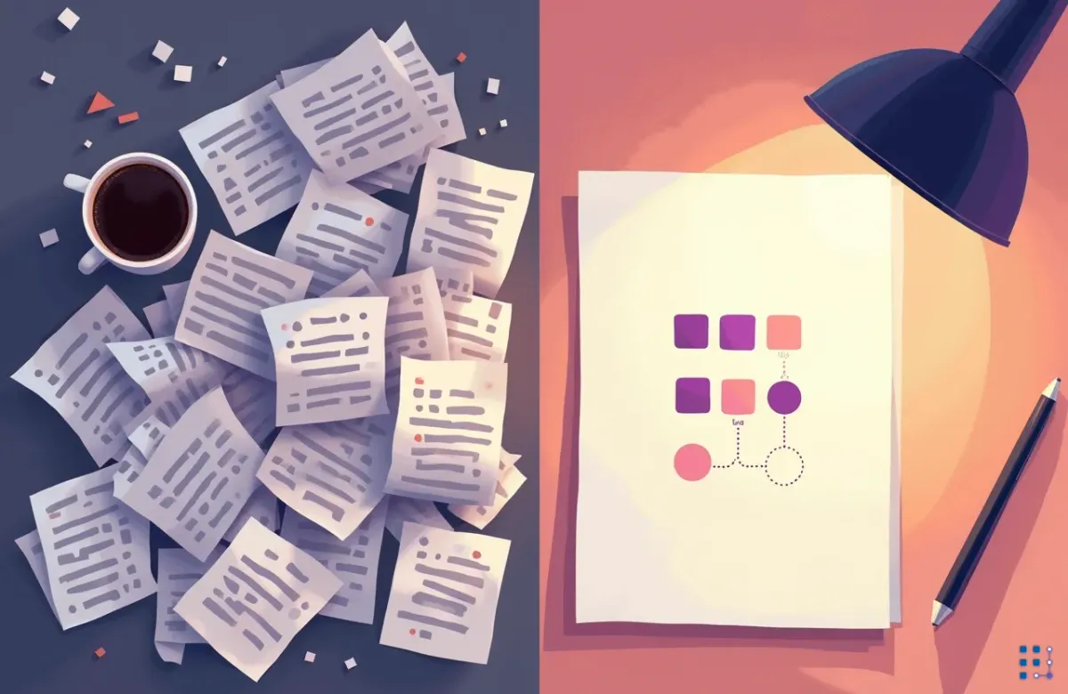
How Pixloom got its mark, and the steps I took.
Back in March, yes March, months ago I needed a logo for Pixloom. Ages ago., vibe coding project with son ( that has been refactored and reinvented a million times, but that's a story for another day ), I was already building the whole product with AI. So the obvious move was to farm the logo out too 🤷 ... I went in very pessimistic .. but ended up surprised.
I went to ChatGPT first. It has image generation built in, and a logo is an image. Simple.
It was not simple.
Round one: ChatGPT
The brief was easy enough. Pixloom is "pix" plus "loom": pixels woven into images. I wanted something small, geometric, that would survive as a favicon.
What came back was a grid of four minimalist marks, then a grid of eight. Pure Pixel. Rounded Pixel. Color Separation. Something called "Loom Hint" with an orange swoosh glued onto a checkerboard. One of them was a 3x3 grid of squares rendered in a soft 3D style like a 2013 iOS icon.
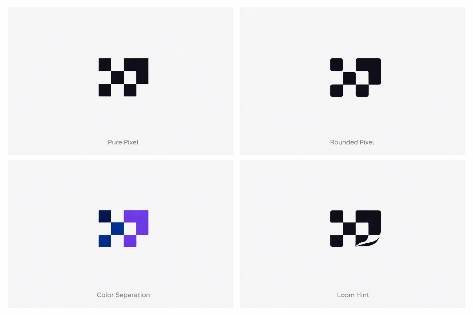
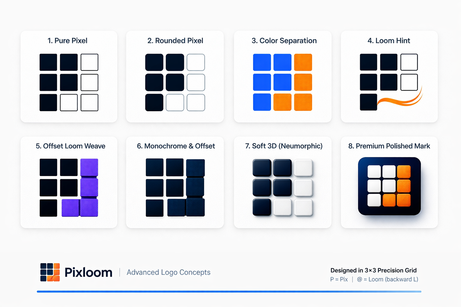
ChatGPT's two rounds. Raster images, no way to edit
Every one of them was a raster image. I couldn't tweak a corner radius. I couldn't say "keep the top row, change the bottom." Every piece of feedback meant a full regeneration, and every regeneration took long enough that I'd tab away and lose the thread. Then it would come back with something that had quietly ignored half of what I said.
At some point it gave up on images entirely and started sending me ASCII art. Blocks of █ characters. For a logo.
That was the moment I stopped.
Round two: Claude
I opened Claude, pasted the same brief, and something different happened immediately: it didn't generate an image. It wrote SVG.
That sounds like a small thing, but that subtly thing made iteration loops faster.
SVG is code. It's a handful of rectangles, circles and lines with numbers attached. So when I said "the squares feel heavy," it changed one number. When I said "what if the thread nodes were hollow," it swapped fill for stroke and showed me six variants of ring thickness. Every round trip was fast and nothing got lost between iterations because the previous version was right there in the file.
I did go back and try SVG in ChatGPT, but still it failed. It did not have "taste".
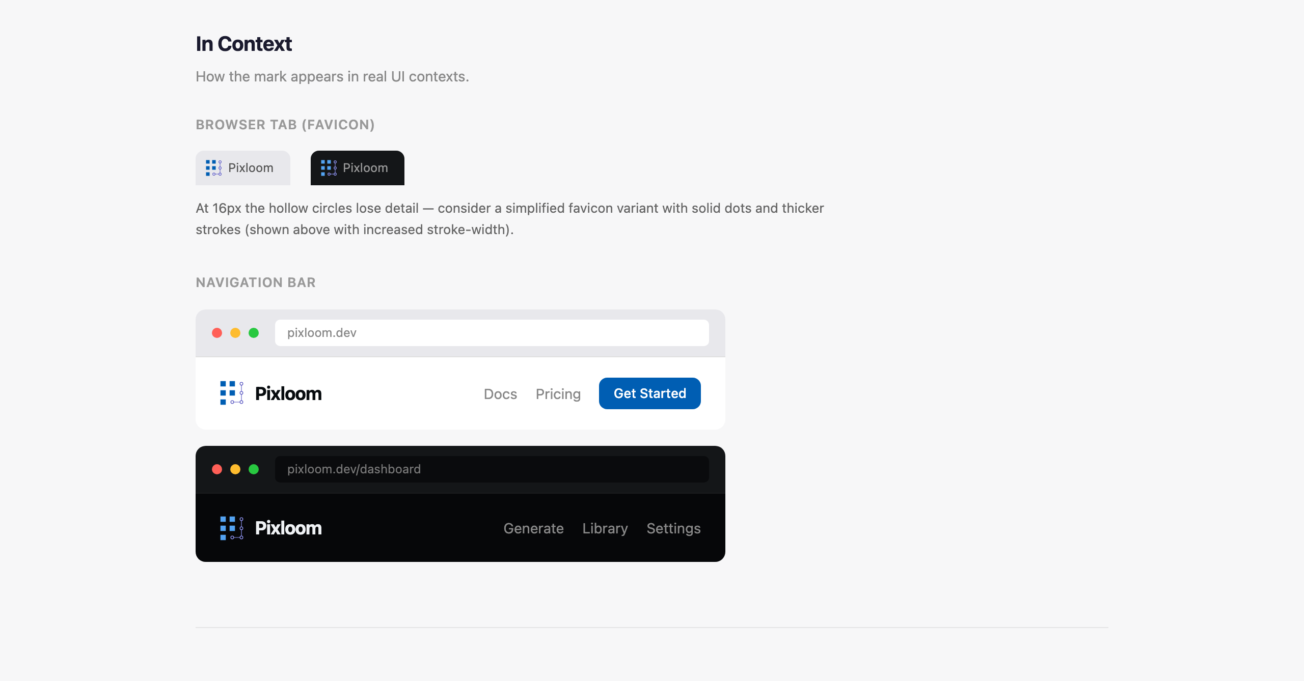
The first pass was a single HTML page with eight concepts side by side: solid dots, hollow dots, thread lines, a subtle grid, rounded squares, a weaving offset. Then the same eight on a dark background. Then one of them scaled from 12 pixels up to 128, because a logo that dies at favicon size is not a logo.
I hadn't asked for any of that. It just understood that those are the questions you ask about a mark.
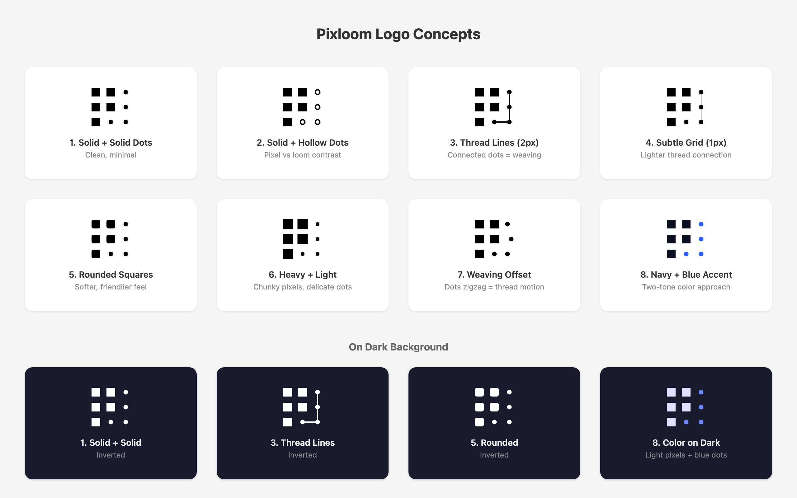
It could actually design!!
This is the part that surprised me. I was like ... wow ... this is great!
When I said I liked the hollow dots but also the thread lines, it didn't pick one. It built a "deep exploration" page with three concept families (hollow dots, thread lines, two-tone color) many variants and then a mashup section where it crossed them. M1
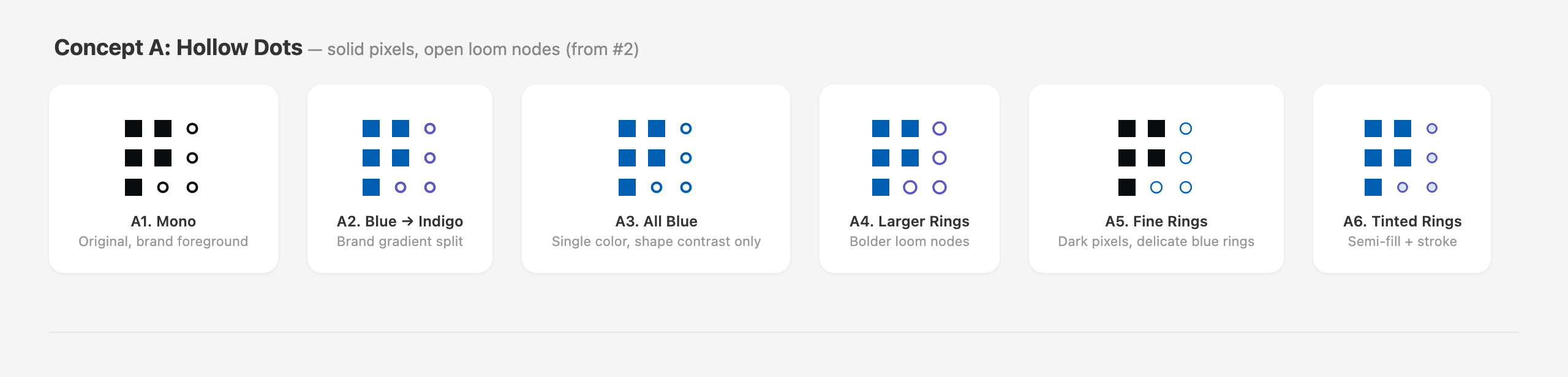
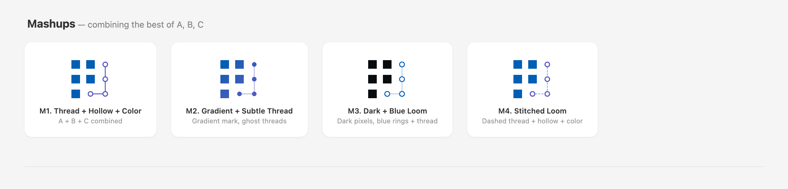
Concept families, then the mashups. M1 is the one on the left.]
From there we went deep on M1 alone. One page just on square size: 14px versus 12 vs 10 vs 8, with and without rounding, with the circles resized ... blah blah blah blah ...
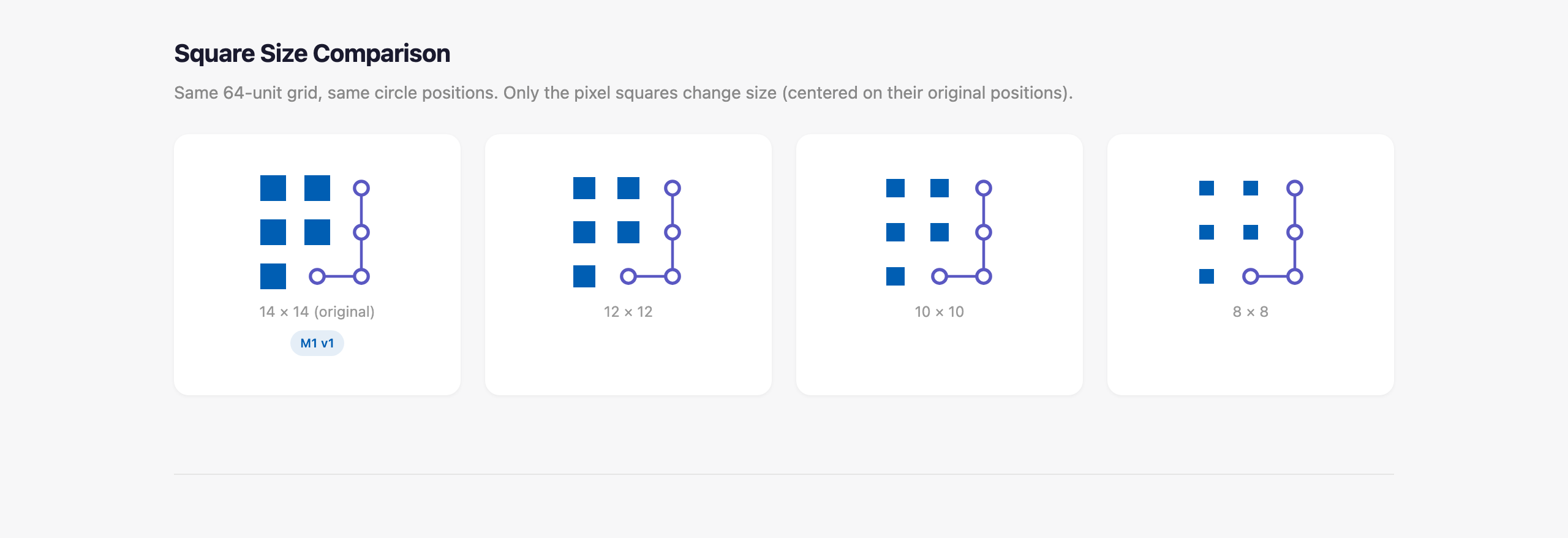
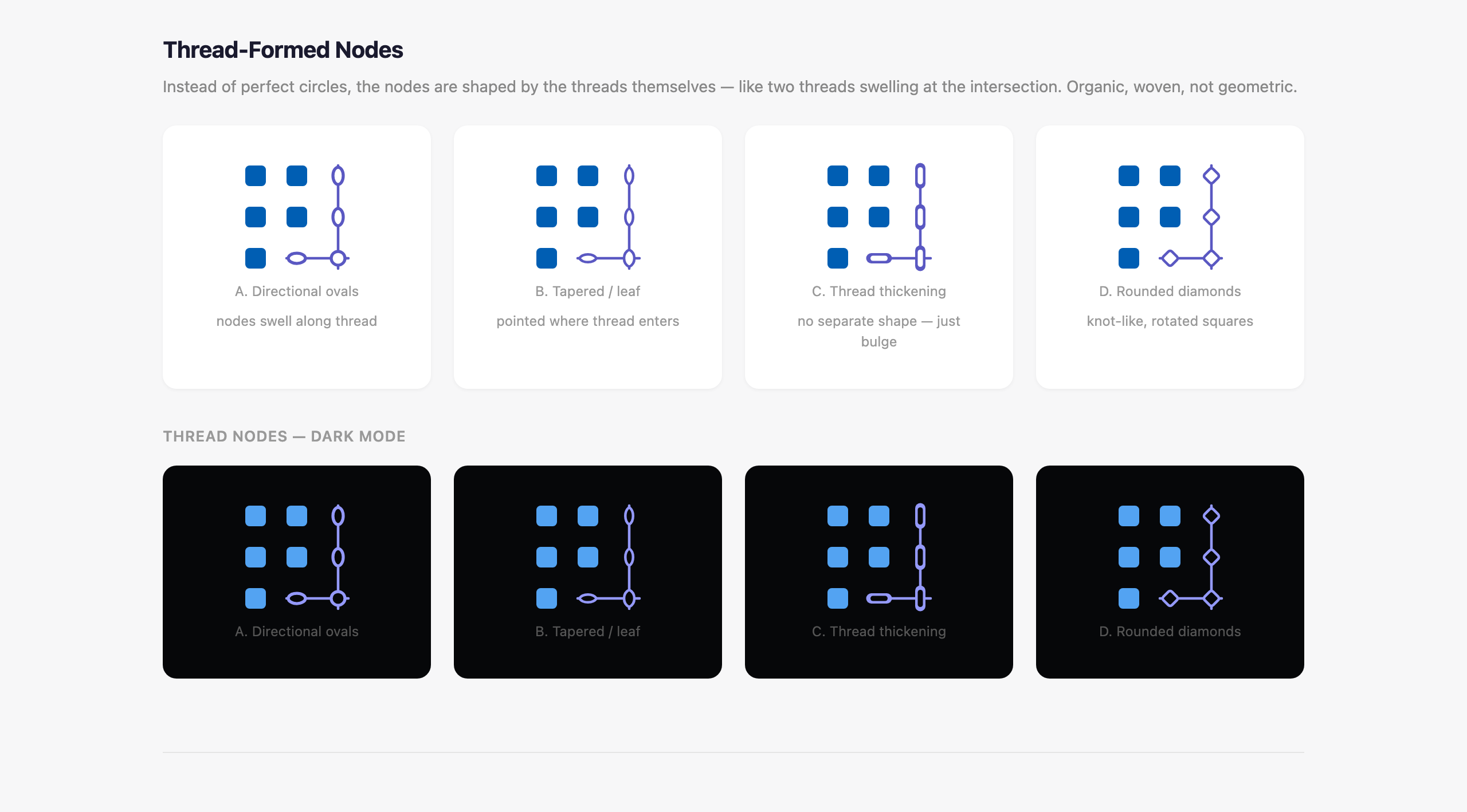
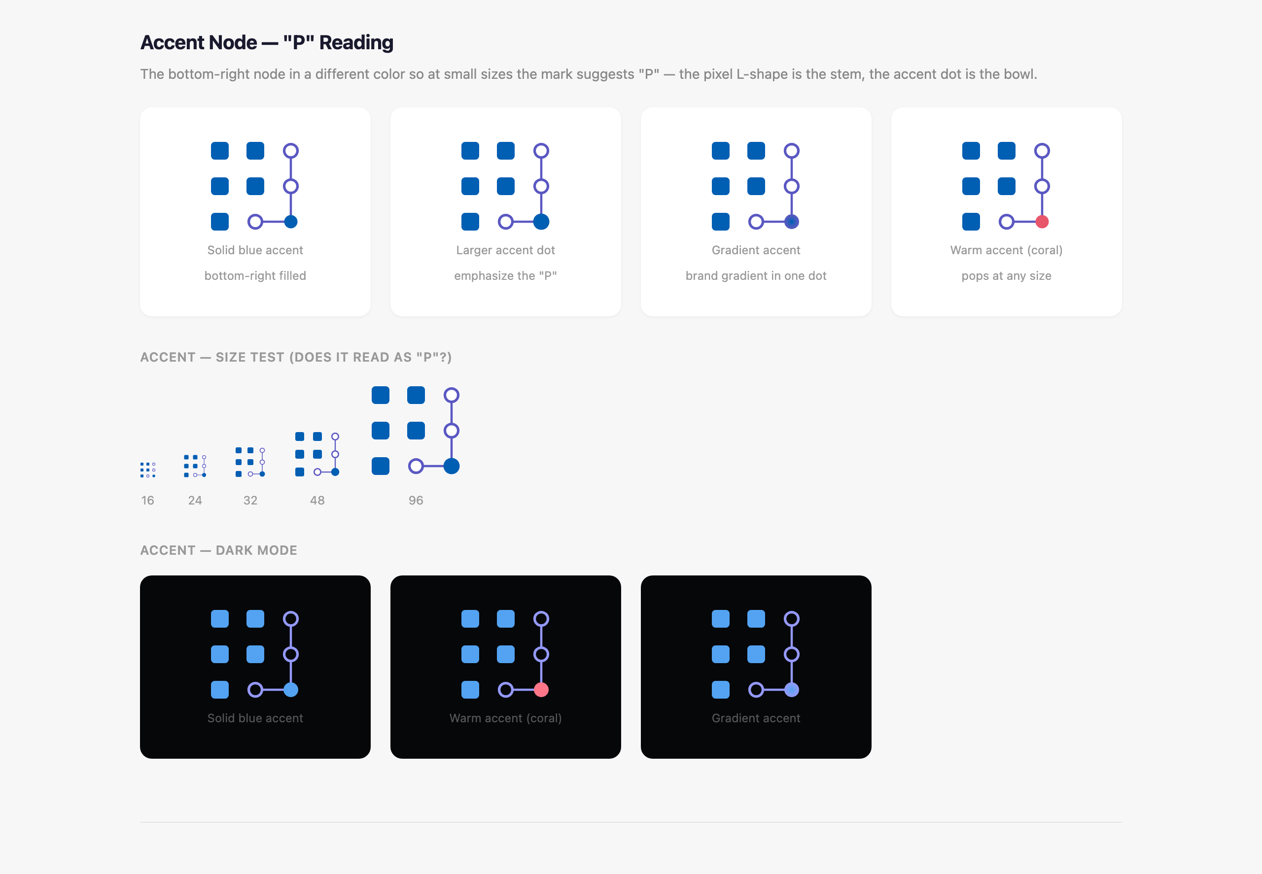
Square size, node shape, and the accent node that became the "P"
That last idea was Claude's, not mine. Filling that one node makes the whole mark read as a "P" at tiny sizes. It's the kind of thing a good designer spots and you don't, and it ended up being the thing that made the logo.
It's aesthetic judgement was consistently good. It knew when a variant was busy. It knew the hollow rings would collapse below 20 pixels and said so before I noticed. And when I pushed back, it didn't just agree, it argued a little and then showed me both so I could see for myself.
The showdown
"We" ended with two directions on one page.
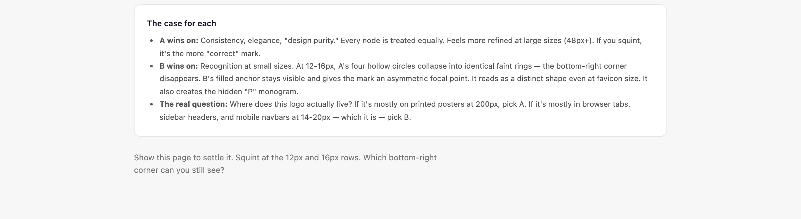
Direction A: all four nodes identical, clean, quiet. Direction B: the anchored corner node, the "P" wink.
Then a final A-versus-B page that was nothing but the tiny sizes, because, in its words, that's "where it actually matters."
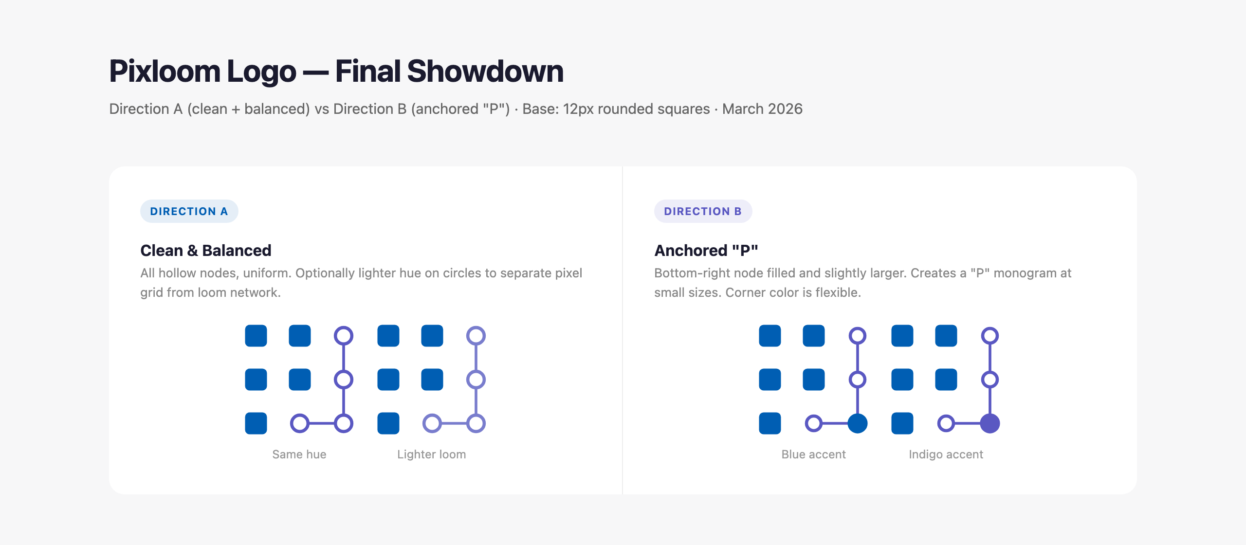
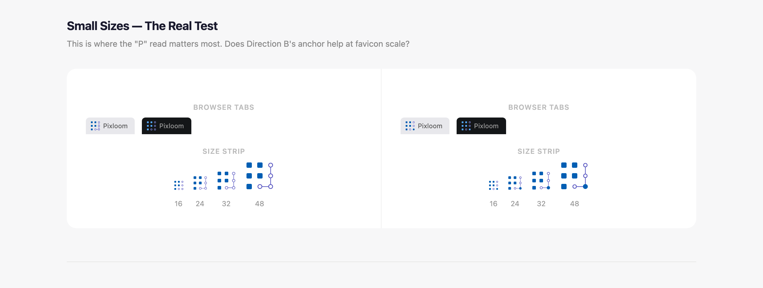
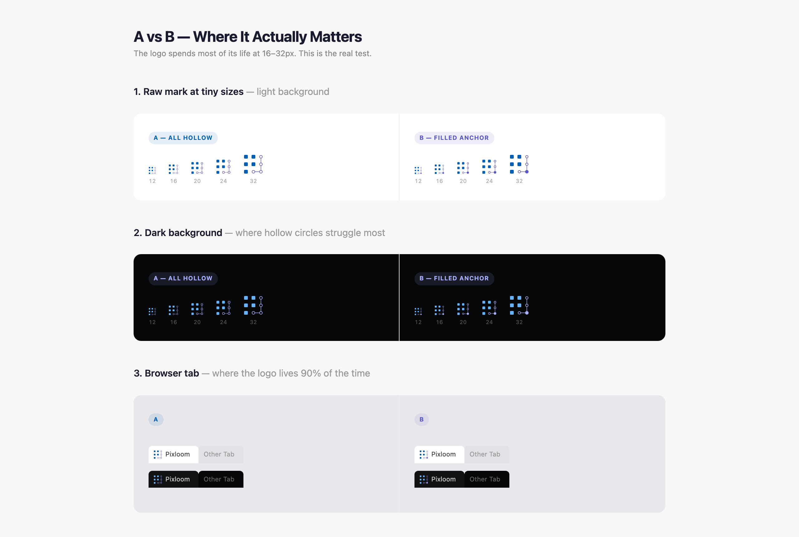
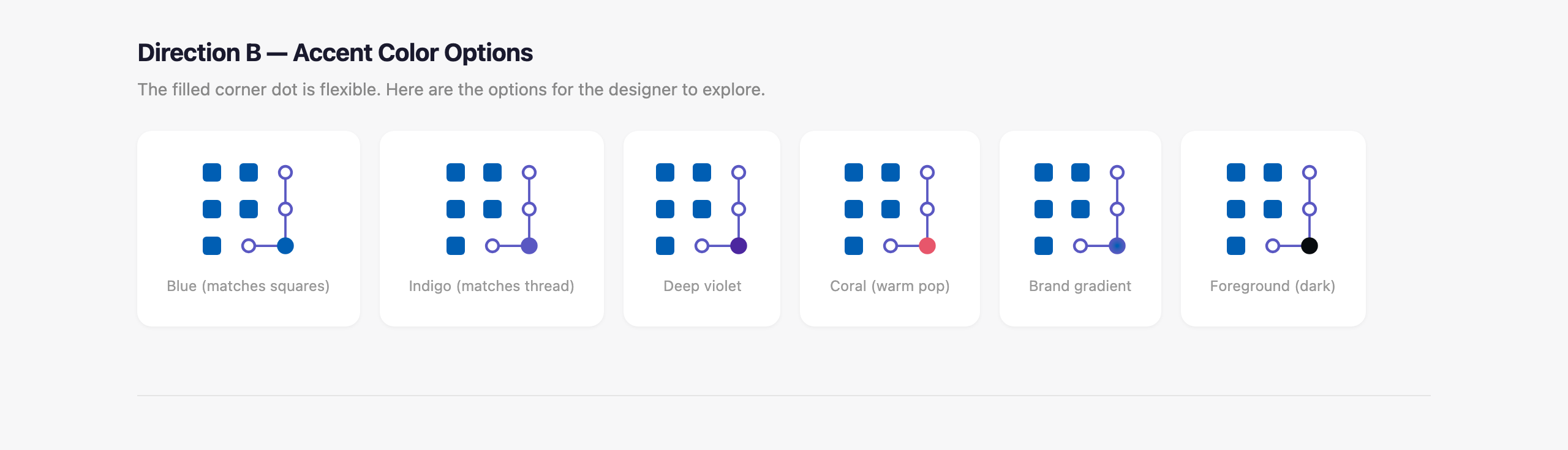
The small-size test, accent color options, and the A versus B page at 12 to 32 pixels
I picked B. It's the mark in the Pixloom right now.
And then a loader, for "free"
While we were in there I mentioned I'd need a loading animation at some point. Twenty minutes later I had two: one that drew the mark in piece by piece, and a "chase" pattern where the pixels erase and rebuild in sequence around the shape. It wrote out the timeline math in the comments so I could tune the hold and step timings myself.
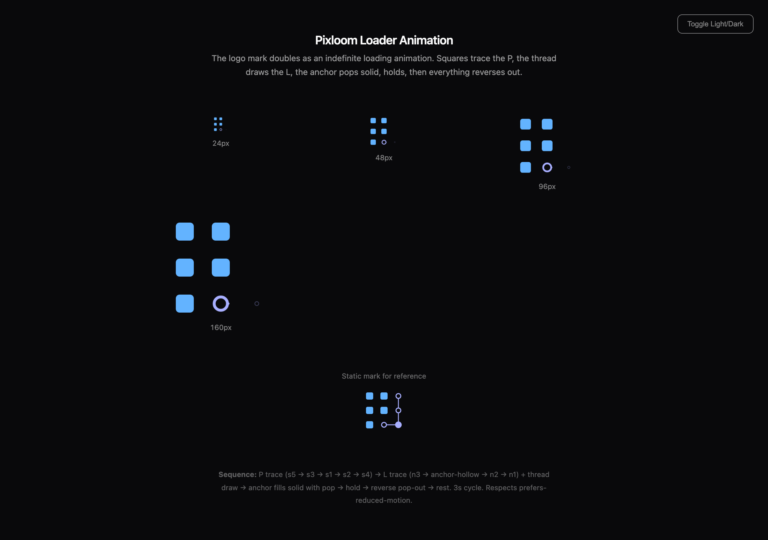
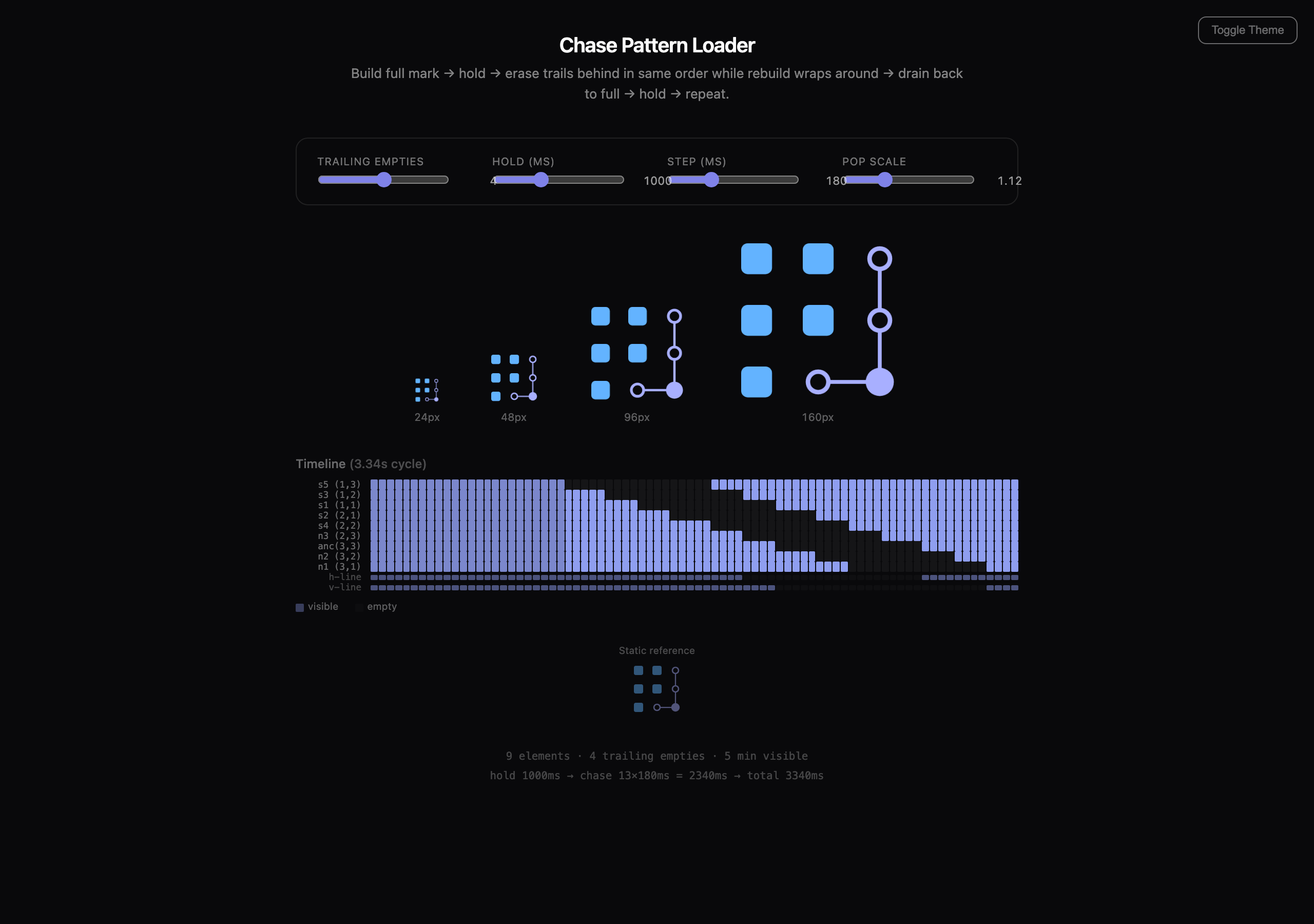
The two loader explorations. The chase pattern on the right is the Playground loader today. A short screen recording of the live loader would be even better here
That became the Playground loader .... logo and the loader are the same object, which is exactly the kind of coherence I'd never have thought of.
What I took from it
This was all before artifacts, before Claude Design, before any of the tooling that now makes this kind of work easier.
It was plain chat, with HTML files I opened in a browser. And it was still the best design collaboration I've had with Ai.
The lesson isn't "ChatGPT bad, Claude good." This is in the past .. they have evolved way beyond that.
Taste. I am sadly here to report, Claude had ( still has ) taste.
For anything geometric, code + svg. A raster image is a dead end. SVG is editable, version-able, infinitely scalable and takes a second to regenerate.
Iteration speed. Design is a loop. Idea, look, react, adjust. If one trip around the loop costs two minutes you'll do six loops and settle, but if seconds, you'll do sixty and land somewhere good.
Push back, Go Beyond. Claude built kept answering questions I hadn't asked yet: what about dark mode, what about 16 pixels, what about clear space. Felt less like just a tool but more like a 🤔
I still have every one of those HTML pages, it's cool to save the evolution ... cool logo, and it cost me an afternoon, time to redo dbulli.com log that I have had for oh 20 years?